Progify is a software engineering and IT consulting firm dedicated to tailoring core services to fit complex business requirements. They needed a brand that felt established yet agile, bridging the gap between heavy enterprise engineering and modern digital flexibility.
The Challenge: The IT consulting market is saturated with generic "tech" blue and abstract nodes. The goal was to create an identity that communicates precision, structural logic, and forward momentum without relying on clichés.
The Solution: I developed a visual system grounded in "engineered minimalism."
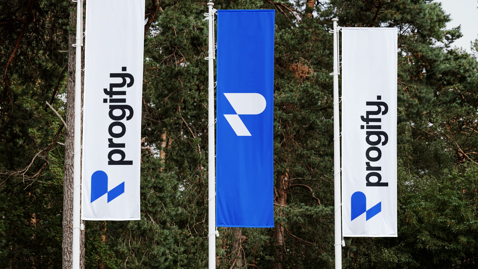
The Mark: The logo symbol is a stylized "P" constructed from geometric segments that evoke a cursor or a line of code, symbolizing the start of a new command or process. Its forward-leaning angle suggests constant motion and progress.
Typography: A bold, approachable sans-serif wordmark that balances the sharpness of the symbol with human-friendly readability.
Digital Presence: The web interface utilizes sharp diagonal lines and ample whitespace to create a sense of cutting-edge efficiency. The layout prioritizes content hierarchy, reflecting the company’s ability to organize complex data.
Palette: A vibrant "Electric Azure" paired with stark black and white creates a high-contrast look that commands attention and instills trust.


One slot open
2-Week Brand Sprint
Logo · Visual system · Brand guidelines · All source files
Everything packaged and ready to use from day one.